By 2022 we will have seen the end of minimalist white and beige interiors and colour will be all the rage again! The paint manufacturers are also making this clear when they announce their colour of the year. The trend colours of the year are diverse, although there is a preference for green and blue tones. The colours of the year are a perfect base or accent colour for a colourful interior and can also be easily combined. So get inspired by these 5 trend colours of 2022!
October Fog
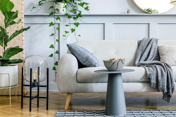
The first trend colour on our list is the colour October Mist, which was chosen as the colour trend of the year by American paint companyBenjamin Moore. This softly shaded sage green colour brings calmness to your interior and encourages individual expression through colour. Benjamin Moore has created some colour palettes with which October mist can be perfectly combined, such as soft pastel shades, warm botanical shades and renewed primary colours.
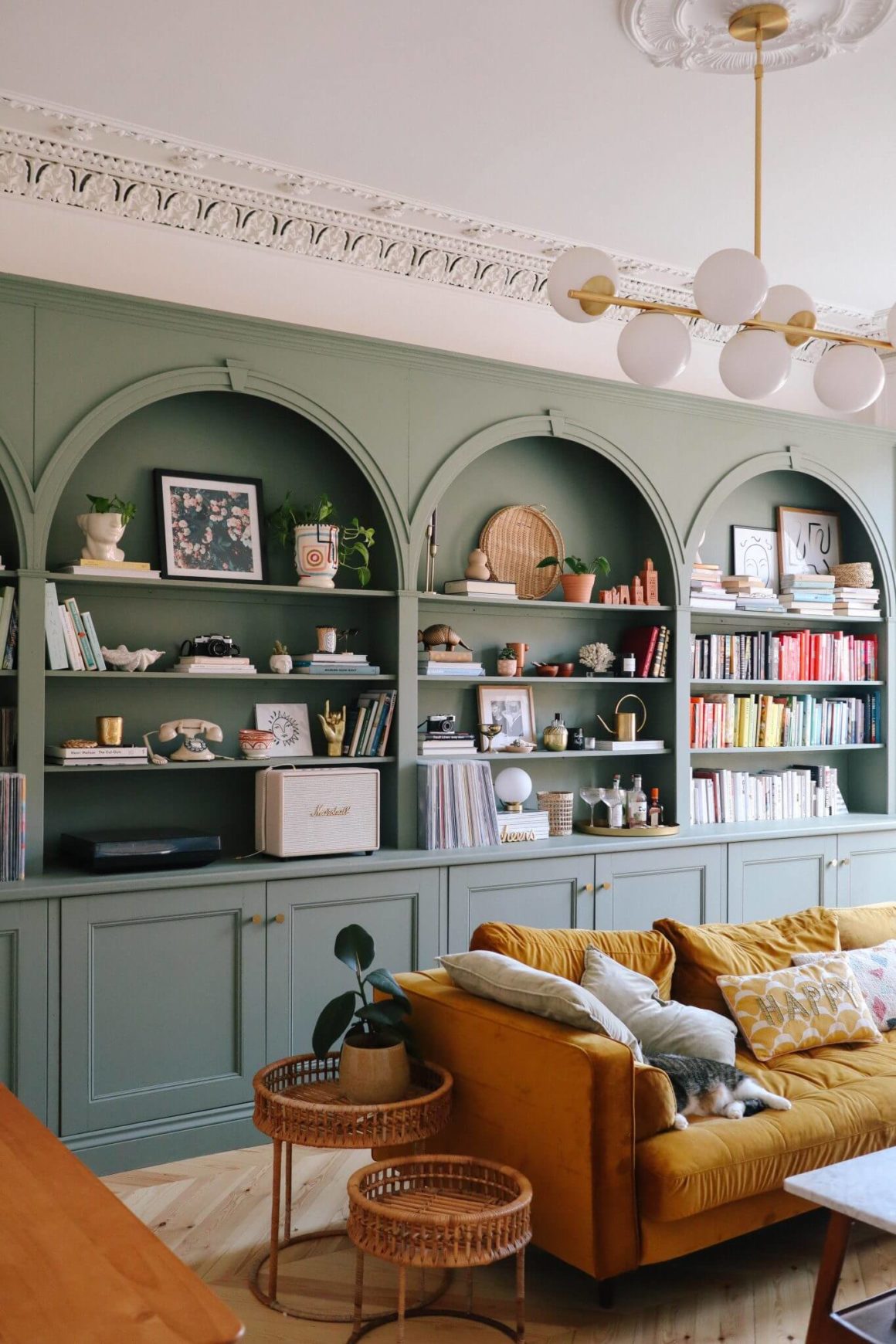
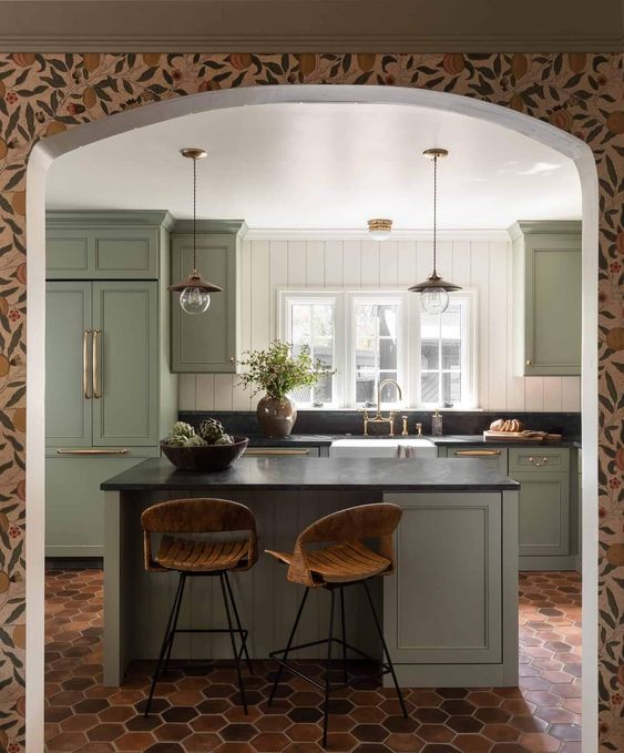
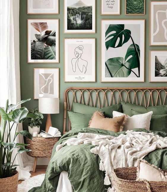
Source: https://www.pinterest.com/pin/1107111520871635691/
Source: https://www.pinterest.com/pin/1107111520871635687/
Bright Skies
Bright Skies was voted colour of the year by Dulux. This light blue colour was chosen because it embodies the themes of “open skies” and “a breath of fresh air”, and because this fresh hue opens any space and breathes new life. The colour was designed to combine perfectly with 37 different colours that fit within four different colour palettes.
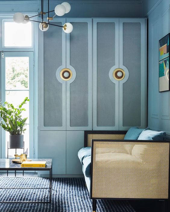
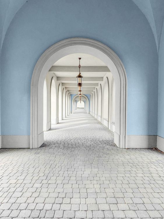
Source: https://www.pinterest.com/pin/1107111520871635698/
Incarnadine
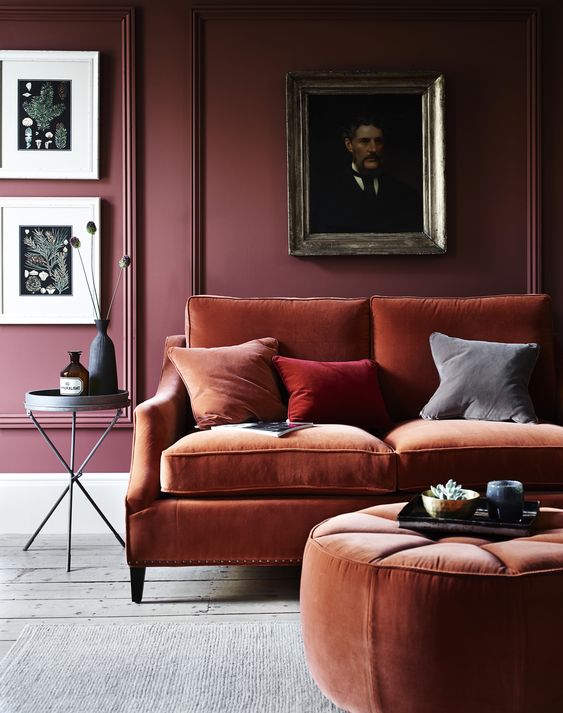
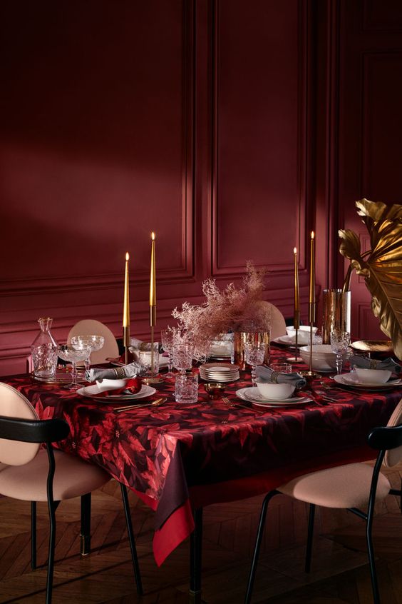
Each year, British paint manufacturer Farrow & Ball proclaims several colours as Colour of the Year. This year they chose five colours including this rich crimson colour Incarnadine. This bold red can transform any interior into a classic and glamorous whole. The colour Incarnadine can be beautifully combined with other Farrow & Ball trend colours such as School House White and Breakfast Room Green, but also light pink and metallics can be combined with this colour.
Incarnadine is a bold red colour that can transform any interior into a classic and glamorous whole.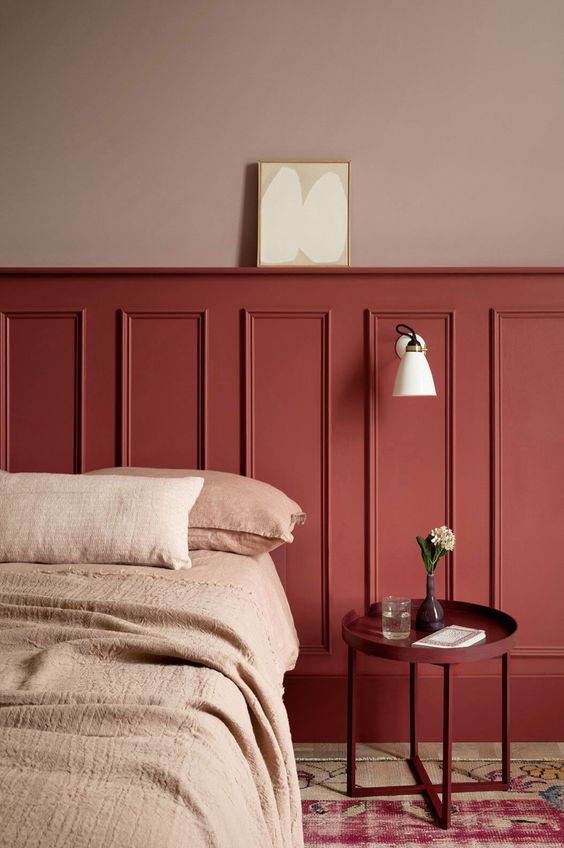
Source: https://www.pinterest.com/pin/1107111520871635761/
Source: https://www.pinterest.com/pin/1107111520871635765/
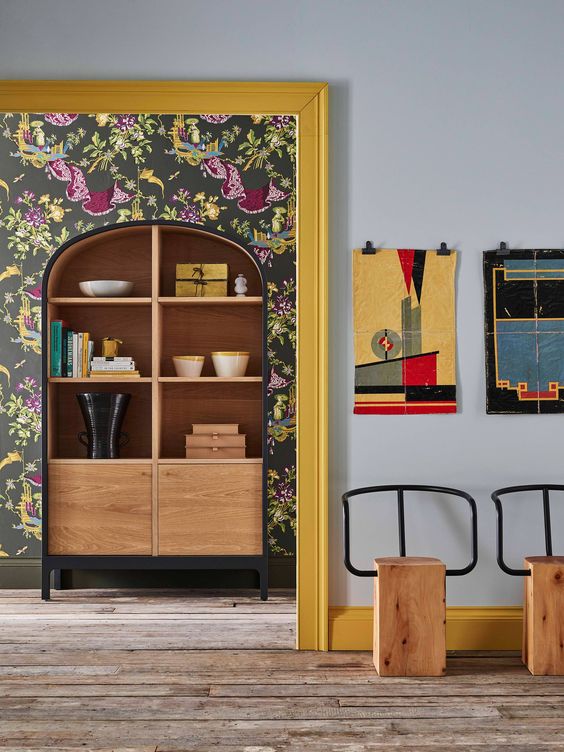
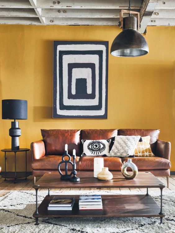
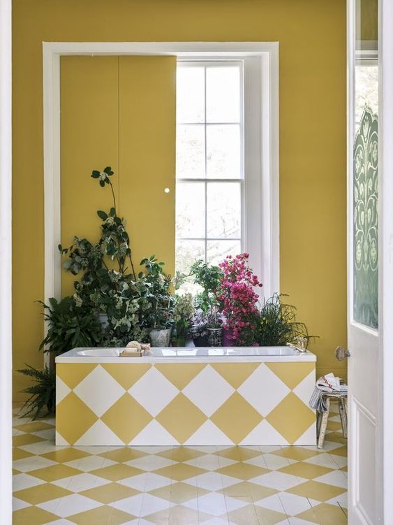
Babouche – the sunny yellow
This cheerful yellow colour got its name from the distinctive colour of the leather slippers worn in Morocco. Like Incarnadine, Babouche is a trend colour of Farrow & Ball. Babouche is perfect for taking the step towards a colourful interior without being loud or overpowering. This colour can be perfectly combined with Farrow & Ball’s School House White, brown, light blue and green tones.
Source: https://www.pinterest.com/pin/1107111520871635823/
Source: https://www.pinterest.com/pin/1107111520871635819/
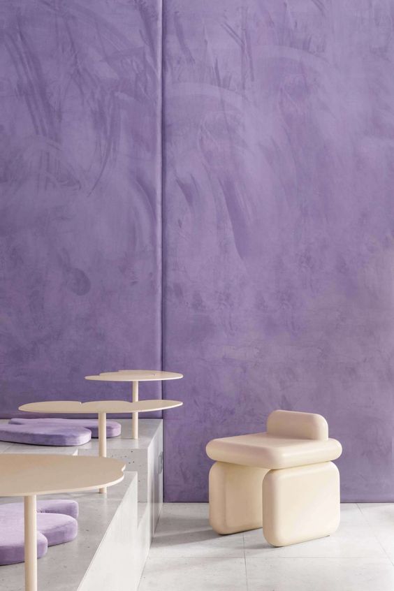
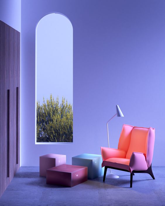
Very Peri
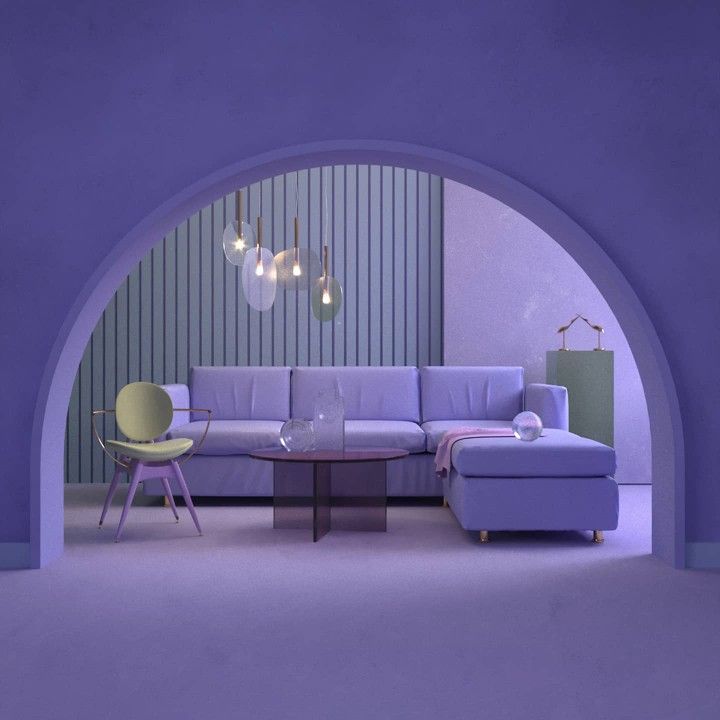
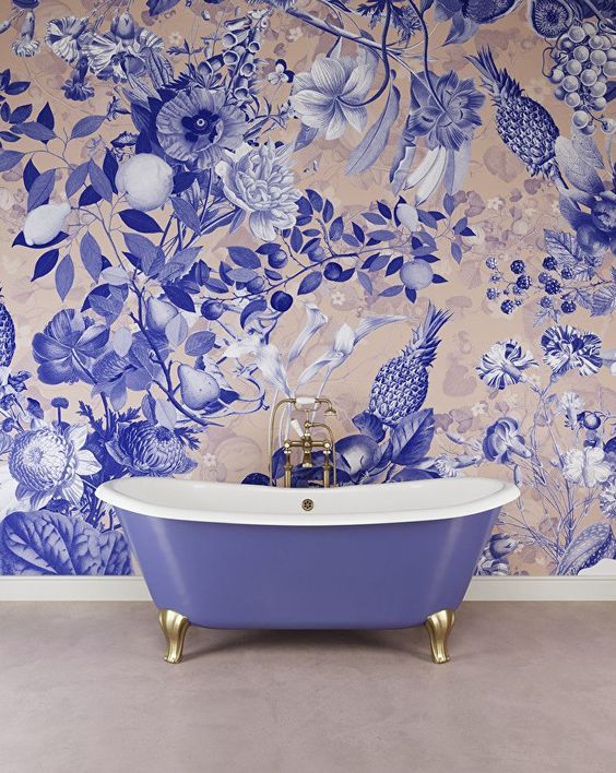
This list would not be complete without the Pantone trend colour Very peri. For 23 years now, Pantone has been declaring a colour of the year after extensive research. This year, they chose the colour Very Peri, a purple colour that combines blue tones with a violet red undertone; this colour encourages personal inventiveness and creativity and should help in this changing world. This colour combines well with different colours, including nudes, beige, pastel shades, burgundy, green and metallics; it is also very versatile colour that suits any style.
Source: https://www.pinterest.com/pin/1107111520871649723/
Source: https://www.pinterest.com/pin/1107111520871635649/
Are you looking for more inspiration? Have a look at our PureLiving page!

